*DISCUSSION* Co-op Tuts Thread


Ad: Buy Girls Und Panzer Merch from Play Asia!

Ausdoerrt

-sama
Retired
So here, this is the discussion thread. All Co-op tuts questions, results, efforts, etc. should be expressed here so that the other thread doesn't get spammed up.

ONLY POST RELEVANT STUFF. RESERVE RANDOM CHIT-CHATTING AND SPAM FOR INSTANT MESSAGING

Go ahead, me and WZ, as well as other experienced artists are ready to help you with your work. Take your time, follow the tuts, and SHOW ME YOUR CREATIVITY!!

Tut thread here: http://boards.fansub.tv/index.php?act=ST&f=24&t=4811
 
trigunsigcopymx3.jpg


Here's what I got from the grunge tut you had. I had to improvise a bit since some of the grunge brushes didn't work with my PS.
 
Great! improvising is good! Sorry, since I can only guarantee performance with CS2. And you got yourself a pretty darn nice result. A couple of things:

First of all, I like your render a lot. You could raise the brightness for it a bit to bring it out some more(or alternatively tune down the opacity of the foreground brushing by a few per cent).

Now for your text. First if all, a nice and loong phrase to cover up most of the empty space. But then - when you wrote $$ was it a typo and you meant just one $? More important that that, it looks kinda... dull I guess... Whatever you did to it (inner shadow or inner bevel?), try taking that off... It would probably also look better if it was the same color as his bright red coat. Then, you could always try adding some glow or using a different font. But, you can always make this one work too.

Also, grunge tends to look a bit boring in general, so if you decrease the sig width by some 50 pxs, and move the font to the right, it just might look better.

However, you did a great job on this thus far, go all the way to make some improvements and you should have yourself a bad@$$ sig =)
 
Thanks. I'll try working on it a bit later. And it wasn't a typo in the text. In Trigun the currency is double dollars ($$)

Edit: Version 2
trigunsig2th5.jpg
 
trigunsig2th5.jpg


Well there is always room for improvement. Of course this time around I will be pointing out one aspect. Levels. Adjusting image levels is a very powerful tool. This feature can bring out the best in anyone's work. Since I don't have your psd, I went about adjusting your sig as a whole and these are my results with adjusting the high, mid and dark tones:

vLevels.png


I don't know how it looks on your screen but I'm adjusting these using a HI-DEF screen. So my my view is very crisp and rich. I don't want to reiterate what Aus already mentioned so I will leave it at that for the mean time.

If you look closely, the levels adjustment really defines your render's rich color and edges. It's very dominant. I'm sure if I had the whole psd, I can balance out everything to be proportionate.
 
trigunsig2zc3.jpg


Well version 3 looks much better in my opinion. The level adjustment really did a lot to make it better. I never really knew that was there. There's still a lot of stuff about PS that is unknown to me, but I'm slowly learning them. I'm learning a lot from both Ausdoerrt and WINGZERO619 so thanks to both of you for the help.
 
Now that's what I'm talking about. Some nice definition to v3. I'm glad our work/suggestions are helping you out. I've put up a lot of vid tuts so check them out. Both I and Aus are coming back to reclaim the artist dome. When I first joined Fansub, the artist dome was dead. After doing my time fullfilling a lot of reqeusts, tihs was a lively place... I started picking up students and and teaching my style to others here. But I left and this place slowly died... so now, Aus and I are making an effort to revive and reclaim what was once ours. We're here to help and guide when we can.

Now for v3. I see you have an outter glow on your render. If you want to give your render some depth, I suggest a drop shadow @60% opacity with distance = 2. On top of that, your money text can be bumped up about 5px along with the vash the stamped text. These are really simple suggestions and you're still learning the ropes of photoshop. So we'll go easy with you lol.
 
No comments what-so-ever on them? Either no1 has read/seen it, they're horrible, or their so amazing your speechless (most likely one of the first two >.>). I'd appreciate it if someone would comment and suggest improvements for me~
 
I will reserve this spot to comment on your work blade. I just need to go to sleep now because of my 12 hour work shift. So check back tomorrow.
 
QUOTE (dchaosblade @ Mar 23 2007, 09:30 PM) Alright, shoot away~
gundamsiggy4yr4.png


gundamsiggypc6.png

Sorry man, I skipped through it for some reason... Would you tell me what tut that was on? Or was it just a random work?
*yawn* too sleepy to comment anyways... I'll do it sometime this week
laugh.gif
 
Both of the sigs were made originally; however the first one used some elements of the grunge tut; and the second one used some basic elements from Wingzero's first Tut in the original Co-op tuts thread.

The first sig is actually a 'new and improved' version of the one I entered into the most recent competition. It contains some new original elements as well as the grunge (which wasn't in there previously).
 
QUOTE (Ausdoerrt @ Mar 26 2007, 11:13 PM)QUOTE (dchaosblade @ Mar 23 2007, 09:30 PM) Alright, shoot away~
gundamsiggy4yr4.png


gundamsiggypc6.png
Sorry man, I skipped through it for some reason... Would you tell me what tut that was on? Or was it just a random work?
*yawn* too sleepy to comment anyways... I'll do it sometime this week
laugh.gif

@dchaosblade
OK, Im getting to it...

Sig1:

Well, first of all I liked your early version better... Your brushing (first of all it's more like fractals than grunge) doesn't fit too well, and it doesn't blend with the render in the BG...

Your BG layer seems to be a gradient of red to yellow(well, any colour really), and brushing sth close to black. From my experience this color combination doesn't work too well in most cases... For this kind of brushes black on white or white on black is the easiest.

Then, I'm not sure if you gave the brushing layer any glow...it normally helps to bring it out...

In general, if you want the brushing to be very basic and simply cover space and not stand out, don't choose such an overactive brushpack... Go with sth like in Barbobot's set - or like the brushes I put into the tut pack =) Otherwise, you'd find yourself using two different techniques that don't match too well together... your brushing should be subtle and look sorta in significant, just to fill up space so that the sig is not empty, like I did in my Gundam sig:
http://i147.photobucket.com/albums/r315/Au.../gundamcopy.jpg

Also, I think that stroke(or glow) on the render should either get adjusted or be gone, because its color matches nothing else on the sig which looks bad...

I like the text, although the glow on it is not quite the right color. Better pick sth from BG =)

Verdict: not bad, but needs work.
------------------------------------------------------------------------------------------------------------------------------------------------------------------------------------------------------------


Sig2:


The idea looks kinda neat. I see you used some filters in the BG to substitute for brushing. While possile, that technique isn't always easy for big sigs. You seem to need some more tuff happening in the sig. For filter sig techniques, contact Wingzero, he's the pro =)

Whatever those bits of brushing or sth else you have there... they don't wuite fill up the sig... It's just missing sth... dunno... Hard to define it...

Try to play more with colors - they don't flow well... Your render on the right is pinkish, yet this color is nowhere else to be found i the sig... And the purple glow on the left doesn't match anything else either... Try make your BG blue-pinkish instead of blue-azure...

Try different blending modes for the border; it looks too plain...

Play around with render sizes and positioning, it's not perfect... Sizing the render down so that the whole image fits is not always a geat decision, unless you have a sig w/ height 250-300pxs

Now text. I dunno what you did to it, but you need to RE-do it =P First of all, back to the color issue, why yellow? Text takes up a lot of space, so it should reflect one or more dominant colors... As little yellow as you have in your sig besides the text, it is still a different kind of yellow... I think that color issue is the main problem of the sig...
As for the bevel, try different modes, make sure you do "Smooth" and your text is in "Soft" mode. It looks really rough... Maybe the depth is just too much...

Then your name in red... Again, no more red in the whooole sig... Use the eyedrop lol. And then, if you use such a fancy font for it, you'd better work on blending options =)

BTW, you could also make your BG more interesting by doing the brushing trick like in that last tut, and THEN do the filters ON it...
Example: http://i147.photobucket.com/albums/r315/Au...loudsigcopy.jpg
Remember, the glow can be gradient if you want more than one color.

Verdict: Nice idea, needs profound RE-working
wink.gif

-----------------------------------------------------------------------------------------------------------------------------------------------------------------------------------------------------------

You have some potential, but it seems like you're a bit lazy =) Remember, every small element of the sig is important, and all of them together need to be in harmony with each other =) With some practice and proper guidance you'll be able to come up with great sigs in no time =) Well, that's what co-ops is all about! ^___^

BTW, don't forget to adjust your levels every time you do a sig ^_________^

Sorry if I was a bit rough in some places, but it's my job ^0^ I wanna see your new results soon!

----------------------------------------------------------------------------------------------------------------------------------------------------------------------------------------------------------------------------------------------------------------------------------------------------------------------------------------------------------------------------------------------------------------------
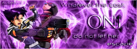
Just a general note, the trick described in the latest grunge tut (the one w/ the glow on brushing) works with other abstract and fractal brushes. You need to be careful though, if your brushing gets too thick, it won't work!

EXAMPLE:

Oni2copycopy.jpg


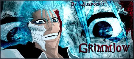
Also, more results on the grunge tut:

Grimmjow2copy.jpg


Good luck in siggy-making!
 
meh it was first time me use grunge brushes so me no feel like making anything too fancy jus basic. mee needs more practice with grunge bush however i did lrearn some new things from this tuts very noce! thx aus
happy.gif


kyonnoimouto1.jpg
 
Well, you got yourself quite a nice sig there =) And levels really do the trick too ^0^ I'd move the render a teensy bit to the left to fill up the space... And the left side in general looks sorta empty, so I dunno... maybe make the font a bit bigger or sth.

But nice result in general, TheBigLolipedoCheese =P
 
Playasia - Play-Asia.com: Online Shopping for Digital Codes, Video Games, Toys, Music, Electronics & more
Back
Top